Hello, everyone. We hope you had a great weekend. It rained here in Lexington, but Mike and I were in Indiana for his class reunion.
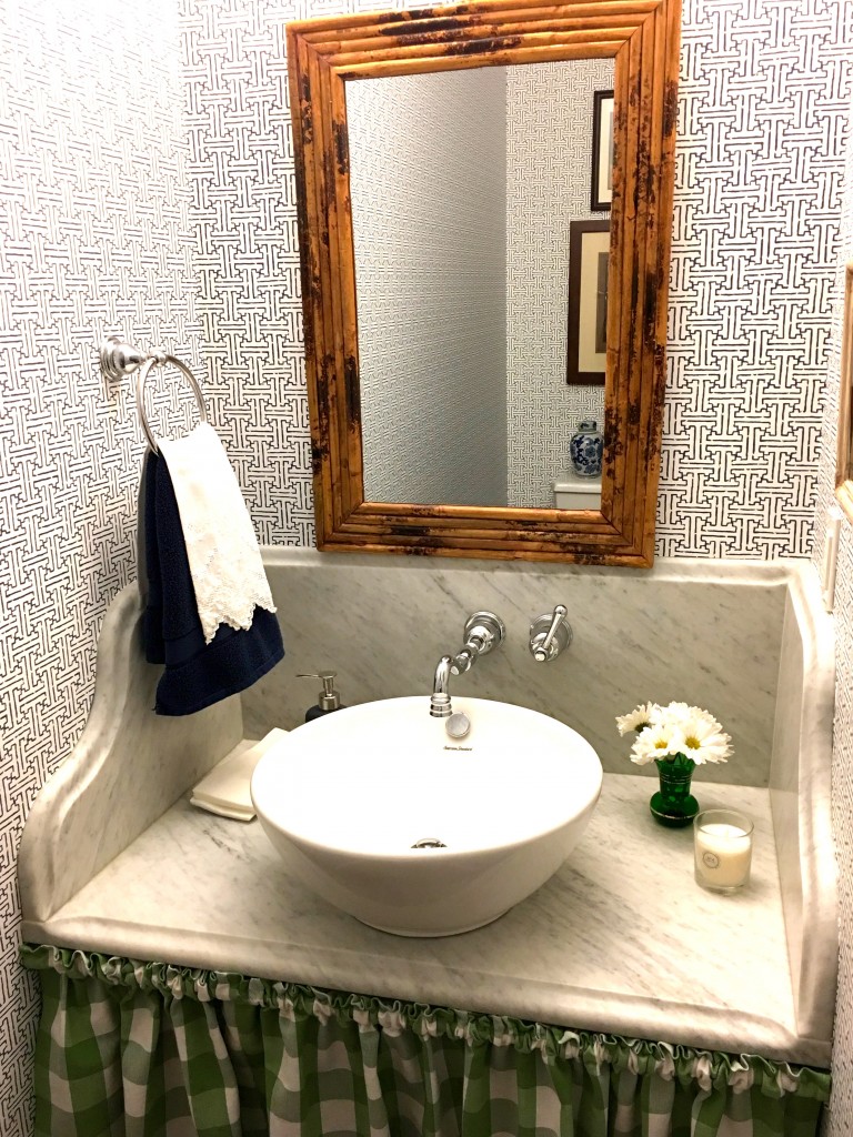
(powder room in our last house)
Well, I learned something new about the townhouse we are remodeling. Our powder room ceilings are just short of being eight feet high. (Our other first floor ceilings are nine and ten feet high.) Since our last powder room’s ceilings were nine feet high, that is quite a change and in a negative way. It’s hard to describe, but we added the powder room where the former sunken kitchen had been. We built up the powder room’s sunken floor to make it level with the main floor, and had to lose some ceiling height in the process. Being that we are a tall couple (I am the little one at 5 feet 8), I am probably the only person who will use the powder room. Of course, our friends will when they visit. The first six papers are from Joss and Main. You can go to their website here, and just type in navy and white wallpaper or whatever you are looking for. Number 7 is from a book called Solstice that I saw at my local wallpaper shop. The last one is by Waverly.
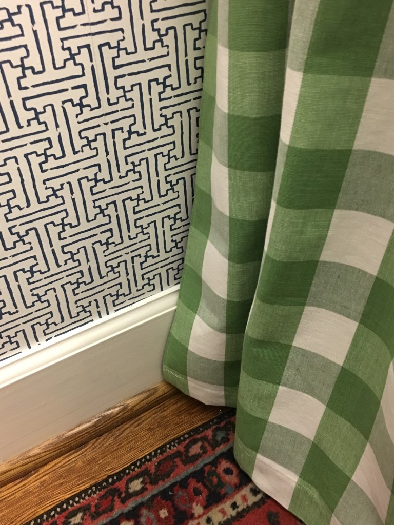
Anyway, I want to wallpaper the powder room, and I want the main color to be navy. The problem is that I totally loved the wallpaper that we put into our last powder room less than a year before we sold the house. It was a nice navy and white graphic, and I was crazy about it. That being said, I am not interested at all in using that same pattern in this house. New house equals new paper in my book. I would like something graphic. At first I thought a stripe might be nice because it would make the room look taller in theory, but I think the stripes I have seen look too masculine or too beachy or too child-like. I just couldn’t find one that spoke to me.
I did find some navy and whites that I could live with, and I would love to get your opinion. I don’t have a favorite. I like them all equally. So, I am asking you to weigh in with your opinion by voting for your favorite in the comments section. At this point, I don’t have a real favorite so I am excited to get your opinion. Thanks in advance, and I will be sure to let you know the results.
#1
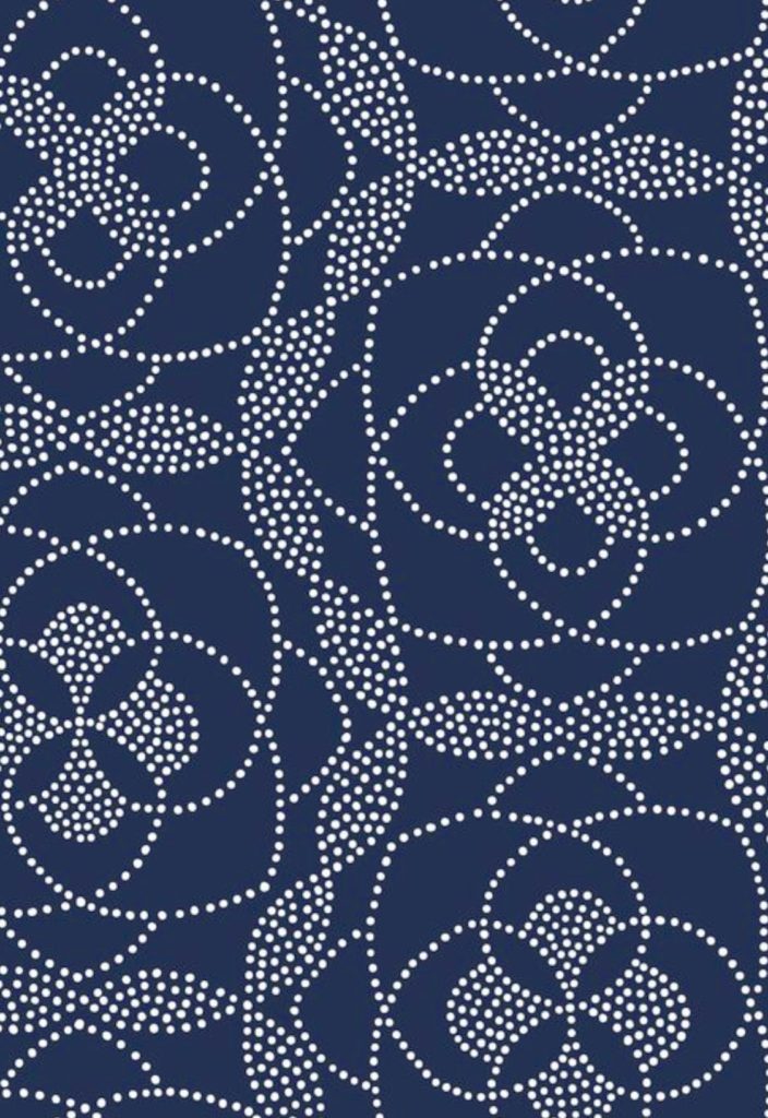
From Joss and Main
#2
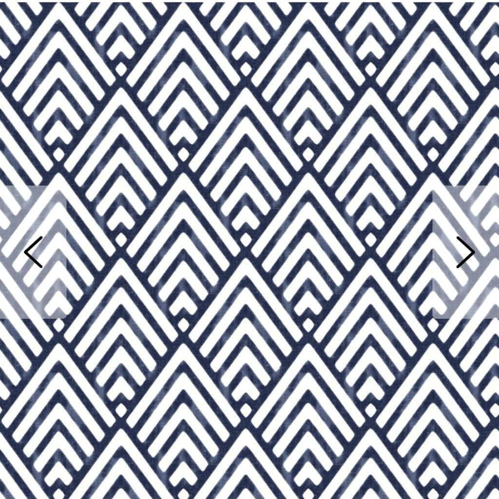
(Ignore those arrows.) From Joss and Main
#3
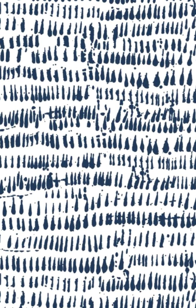
From Joss and Main
#4

(Sorry, but it’s a little out of focus.) From Joss and Main
#5

From Joss and Main
#6
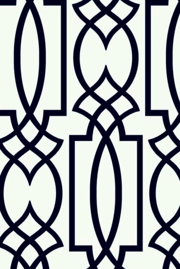
From Joss and Main
#7

From a wallpaper book called Solstice
#8
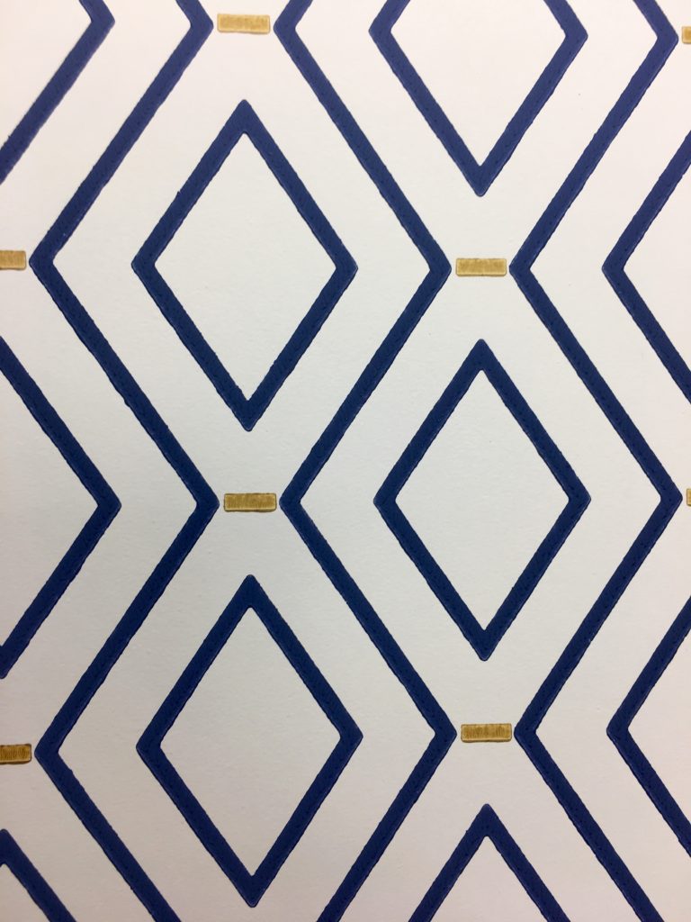
By Waverly
Thank you for helping me.
Take care.
Affiliate link used.


Number 6 is my favorite. Number 8 is a close second favorite. Looking forward to seeing what you choose. Happy decorating!
#2!!!!!!!!
#1 and #6. I’m doing over a tiny powder room and was thinking navy wallpaper. Can you add the sources? Looks like some are Wayfair’
Mary Ann, 1 through 6 are from Joss and Main. I found the last two at my local wallpaper shop but don’t remember the books right now.
#8, with white vanity (pedestal sink)
Two and three are my favorites. Two may draw the eye up making the room seem taller.
1,3,4,6. I am terribly decisive as you can tell.
1, 5 &6
Like them all, but my vote is for #2.
Number 2!!! Number 8 second choice.
# 3 !! Its different !
My votes are (in order) #4, #8, #6 (although 6 appears on my screen as black rather than navy). Fun following your progression. Look forward to seeing the final result!
Best,
Linda
Number 2 and number 8. I love number 1 but if the powder room is small the dark wallpaper might make it look smaller.
#1 is my first choice because…it’s fun…swirly, twirly. I also really like #2…those look like mountain peaks. Or arrows pointing up? Might give the illusion of height? Have fun making your choice! 😉
I like 6 and 8 also.
I like #1
Number 6 is my favorite, but I also like number 5.
I like #1. Some graphics in a small space make my eyes cross.
I’m a newcomer to your blog, and really enjoying it! I like #2 the best as it may have the same effect that you were looking for with stripes. My second choice is #8.
Welcome Kathy. Tell your friends about it. You can subscribe for free.
Agree with Mary Ann – numbers 1 and 6
#1,2,5,8. Do not envy you having to choose!
❤️#8
I like #2 and #3 the best…..
I like #4 with the different shades of blue.
2 and 8 are gorgeous and versatile!!
#2 & #8
I’m partial to #2. It’s clean and it’s graphic. #7 would be my 2nd choice.
I like dandelion white navy from spoonflower below. What do you think? To me this is a happy and pleasing paper and looks to be easy to work in with accent colors. Your choice will be interesting.
https://www.spoonflower.com/shop?type=wallpaper&view=designs&shop=wallpaper&t=navy+and+white+
Thanks, PEnny. I checked them out, and the first one was my fave.
#1 for sure! Favorite for small bath. Others nice but best for larger rooms!
I prefer number 1.
I’m liking 2 and 7.
#8 and #2
#7,#1
#1! #1! #1!oie
#1, #5. #7
8
I love # 7, Since I am a huge fan of Greek key design motifs and I think this comes closest to what I would choose, if I was going for an architectural look. My question would be: what kind of light does the room have, both natural and artificial. Secondly, how large is your space. Are you trying to achieve an open look or more of a closet feel.
Beth, the room is 5 x 8 and has no windows. I don’t want it to feel like a cave. There are two canned lights in the ceiling, and there will be a sconce on each side of the sink mirror.
1, 3, 7
8
I like 8 with its “touch of gold”